I'm working on one of my longer articles at the moment,
however I thought perhaps something short and to the point might be appreciated
every once in a while so I think I'll start a new section called Diminutive
Diatribes, tackling issues that, while important, don't quite warrant a full
analysis.
This one is
about the size of text in modern video games.
You see, I recently started playing Darksiders 2 for the PS3. However, what struck me most was not the
moody atmosphere, sarcastic and amusing main character, or the interesting
world. It was the size of text on
everything from subtitles to menu screens.
It's so microscopic that it is impossible for me, with a 30 inch CRT
television, to read when I am sitting less than a foot away. I do not understand why so many modern games
insist on doing this. The Dead Rising
series is another notorious offender, but it doesn't stop at just size. Some games have text that is colored the same
as the background. Good luck picking out
story details from that.
 |
| It may look a decent size from here, but this image was taken from a widescreen enabled television. So, look at the font, the size, and the color of the already small text. Now, decrease the size by half. That's what it's like trying to read Darksiders 2's menu screen. |
Game
developers, I realize that you may not think about the size or color of your
subtitles or texts or menu screens since they're not as flashy as the graphics
or cut scenes or gameplay, but really, you need to. In older games you could tweak a huge amount
of the menu and text screens, from how fast they could appear, to the color or
size of the backgrounds of text boxes, up to some games allowing the text's
font or color to be changed. What I do
not understand is why this was ever taken out.
And why it was not expanded.
Games are loved by people of all ages and creeds. However, not all of us are equal in certain
regards. Some of us need glasses to
drive or to read and so we can't read a game's menu without them. Others have good eyesight, but cannot afford
a large 30-50 inch television so that the text can actually be read. Some people are on a budget. And for these people, you will undoubtedly
lose sales if they buy a game, realize they can't understand what's going on
due to the small text, get frustrated, and demand a refund.
 |
| This problem is especially prevalent in MMO games. Look at how tiny that text is! I'm supposed to keep track of that in the head of battle?! |
This is
impossibly simple to fix. It's little
different from going into Microsoft word and changing the font or the color of
the text there. Why do game designers
not give players the option?! Look, I
can sympathize to a degree. In previous
console generations, there was not as much a need for this kind of discussion
because everything had text of a certain size to correspond to the average size
of a CRT television, which used to be the predominant model. But with the jump to HD graphics, wide
screen, and LCD televisions, you need to accommodate for people who cannot
afford the biggest or best television.
Otherwise, you will lose sales and long term customers.
 |
| AAA games do this far too much. Look at Ni No Kuni. White text on a flashback with foggy white borders? Yeah, that's not hard to read at all... |
If these
size, color, and display problems continue, other games will be affected as
well.
Maybe people don't worry about an
action game like Dead Rising having these tissues, but in a shooter or an RPG
where knowing the stats and capabilities of weapons, spells, etc. are essential
to survival, this will be a make or break issue for gamers.
Worse yet, many younger gamers learn to read
or practice their skills reading through video games.
I know I did when I was young and a number of
other gamers,
like the Spoony One, attest to learning reading through video
games.
However, if the text is
unreadable, those games become crippled, unlikely to appeal to as wide an
audience as they could if the size could be changed.
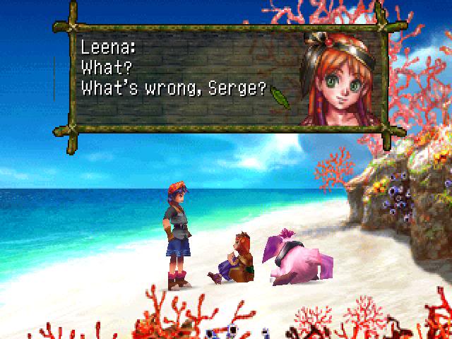 |
| Compare modern gaming text to Chrono Cross, a game made in 1999 |
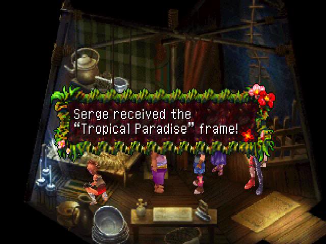 |
| Not only is the text readable and it pops, but you can choose for yourself the kind of frame you want for the menu and dialogue boxes, choosing ones that are better for your eyesight, resolution or just personal preference. |
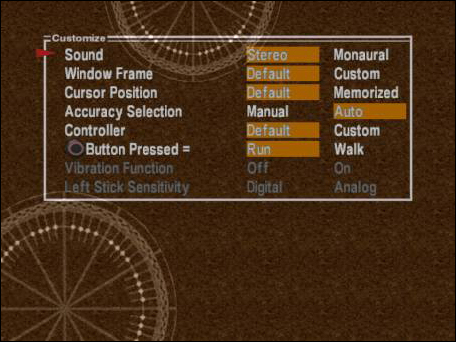 |
| A 14 year old game offers more customization options for the player than modern AAA titles. What's wrong with this picture? |
This issue is not as
widespread as say, region locking or pointless deaths or over used cinematics,
admittedly. So far, only a handful of
games have adopted the too small to read or too similar in color to the
background to understand. The problem
is, the games that have are AAA titles.
Darksiders and Dead Rising come to mind, but even something like Ni No
Kuni has these problems. The white text of
that game sometimes gets hidden by background or foreground objects, like
clothes or snow or a fence that is the same white color as the text. Or if important words are outlined, they are
so dark they cannot be read. For a game
with that much development time and that big a team, do not tell me that you
could not hire one person to change the color or size of the text, or at least
offer an option for a text box to make it easier to read.
 |
| I miss the days when menus and text used more colors than dark grey on grey or white on clear. This is too hard to read! |
If game developers do
not nip this issue in the bud now, it will be a big problem down the line. You cannot put a voice to everything...menus,
battle data, stats, etc. will continue to be silent and will need to be read to
be understood. And a game that players
cannot read is a game that players cannot play.
And games that cannot be played will inevitably bomb. Hard.
No comments:
Post a Comment